CoPilot Live

For all of the App Store restrictions, the lack of proper turn by turn sat nav software seemed to cause the most grief. The iPhone was more than capable of running the software but Apple restricted the sale of turn by turn navigation software until OS 3.0 was launched. Alongside that announcement was the news that Tom Tom would be coming to the iPhone with a software and hardware add-on. Many have waited for Tom tom due to it’s history and market share but I plumped for CoPilot Live, partly due to it’s good reviews and partly it’s price of £25.99, less than half that of Tom Tom.

Even though the price is excellent this isn’t an under featured sat nav. The features include (yes, lazy cut and paste from their website):

  • Full spoken turn-by-turn voice directions
  • Detailed street maps of UK and Ireland with full UK post codes stored on your iPhone
  • Clear 3D and 2D driving views with SmartZoom™ speed-variable zoom and street names
  • Navigate to a house number, street, intersection or address book contact
  • Automatic portrait and landscape display switching
  • Comprehensive multi-stop pre-trip planning and preview
  • Route optimizer works out the best way around multiple stops
  • Intelligent navigation provides guidance in tunnels and underpasses
  • Automatic day/night mode
  • Navigate to thousands of Points of Interest
  • Lane indicator & CoPilot ClearTurn™ provides a more realistic view of motorway exits and junctions
  • Real Signpost display matches real-life signs
  • LiveLink™ location sharing and messaging: keep track of your CoPilot friends, live on-screen!
  • Live 5 day weather forecast for your location or destination
  • Roadside Assistance helps you contact your breakdown company and tell them your location
  • Huge range of customization features to suit the way you travel
  • Customized trip status displays, including eta, distance remaining and more
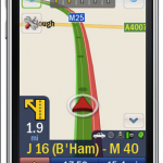
CoPilotNot a bad list of features but does it work? I tried it last week when I was away on business and driving between Bristol and Bath I had no issues – in fact I was really quite impressed. Once the GPS had locked onto my location I entered the postcode of my destination and CoPilot quickly worked out a route. One issue I do have is that you can’t easily see an overview of your route. You can move around the map and zoom out but it would be nice to see the total route before commencing your journey. For the first journey CoPilot recommended a different route from normal – I trusted the normal route and pleasingly CoPilot recalculated in 2-4 seconds which I was happy with. I read some comments on the App Store reviews that people thought this was slow but I don’t see it as an issue.

The rest of the journey went really well – clear instructions on both vocally and on the screen and the GPS positioning was excellent. Chris also picked up CoPilot and felt that when the car was stopped, CoPilot would ‘shut-down’ and would take 10-20 seconds to start working again once he had started moving. I haven’t noticed this issue but others are reporting it and it will allegedly be addressed in the next CoPilot update.

Other journeys have worked really well. I found the controls a bit odd though. Unlike other app’s on the iphone this doesn’t really take advantage of iPhone controls. It feels like a sat nav – big buttons and a non qwerty keyboard (fix in next version). I’m mixed on the looks – it’s functional but isn’t the best looking. Looking at Tom Tom they seemed to have delivered an ap that looks and feels like other iPhone app’s. Time will tell which design approach makes most sense.
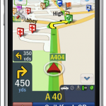
CoPilot 2Despite reservations with the menu’s, I think the map graphics are excellent. Clear in either 3D or 2D modes with support for different colourings and night modes. No complaints there. The audio is also very clear with six different voice options. The maps display Points of Interest and they can also be selected and navigated to. One update for the next version is the ability to call a Point of Interest like a hotel or museum which will be handy. One large omission is speed camera’s which CoPilot’s rivals do have. Again this will be addressed in the next update. It looks like CoPilot decided to get this release into the App Store as quick as possible ahead of Tom Tom. Ultimately this is a smart move as the software is more than capable on this release and at this price is an absolute steal. There are also some Live services included – you can see friends on the maps as long as they let you follow them, see a 5 day weather forecast for current location and also contact emergency services with your current location. One Live Service which will be a paid for (I guess monthly subscription) is traffic reports, similar to other sat nav systems.

After using CoPilot for two weeks I have no regrets picking this over Tom Tom or the other sat nav app’s available on the iPhone. CoPilot works well, it’s location searching hasn’t failed me yet and the software has a lot of features that work well. It also removes the need for separate sat nav hardware and at £26 that a bargain thats hard to ignore. Hopefully the 1.1 update will address the shortfalls mentioned above and there is one niggle that I haven’t seen mentioned elsewhere – will map updates cost money i.e. yearly updates? Only time will tell.

To see a comparison of all the iPhone sat nav app features, see this comparison chart.

The Edge of Flash

As a developer, it’s easy to concentrate solely on the technical aspects of creating applications. Often, technical people are not creative by definition – with the reverse also true. However, there are groups of people out there that can meld both technical and creative brilliance into something truly special.

But where to find these nuggets of web joy? Well, the Adobe Edge newsletter has a section in it called “The Edge of Flash” and every edition sees more of these fusions uncovered.

You can find an online archive of all the previous editions of the Edge Newsletter as well as a link to subscribe should it take your fancy at: http://www.adobe.com/newsletters/edge/

And, just to wet your appetite, I’ve picked out a couple of direct links to just two applications that blew me away.

An interactive music experience:

http://soytuaire.labuat.com/

Pictures can’t do this fully interactive experience justice. But I’ll post one anyway.

pick3

And here’s a video if you can’t be bothered visiting the site. Soytuaire

You never knew t-shirts were this much fun:

http://thankyou.thisisgrow.com/TFWA

Again, it’s interactive so piccies are ineffective – just visit the site!

pick4

App Store Expense Monitor

Everyone likes the App Store, right? Easy to buy, one click and the app is yours. No credit cards, no fuss – awesome. But how much are these app’s really costing you? If you spin through all your app receipts you can get a total costs but there is an easier way for Mac owners – the free App Store Expense Monitor.

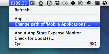
App Store Expense Monitor

The app runs in the menu bar and show a running total of how much you’ve spent so far on app’s. As you can see from the screenshot my total is £189.25. Ouch. The app scans your application directory and gets the current price of each of the app’s you have installed. While that gives you a rough spend it doesn’t cover the changing prices of app’s over time. However Expense Monitor has that covered as you can edit the price for individual app’s.

Nice little app that is simple and free while being scarily informative. So how much have you spent on iPhone app’s? Let us know in the comments.

LittleSnapper 1.5 and Ember

There are no shortage of screenshot snapping tools on the Mac but one of the best I’ve used is LittleSnapper from Realmac Software which has recently been updated to version 1.5. LittleSnapper makes it easy to snap screenshots and websites in a variety of ways but more importantly it helps you organise your snaps into collections for easy retrieval.

The capture engine has been re-written for 1.5 and allows for full screen and timed captures. The timed capture is a welcome addition as previous to 1.5 it wasn’t included which was frustrating. You can also snap an area instead of the full desktop and also a window. One nice feature is holding down shift when selecting multiple windows will create a separate snapped image for each window. Hold down cmd when selecting windows and only one image containing the selected windows will be created. The webpage snapping doesn’t just snap what is currently visible – LittleSnapper will snap the full web page which is great for keeping screenshots of inspirational sites as you surf. View the webpage within LittleSnapper and you can select individual elements of the page to snap which is far easier than selecting an area.

Your screenshots and images are held in a local library. Within the library you can organise by type (mockup, illustration, screenshot etc), folders and collections. Each image can be tagged too which makes it easy to find an image in a large library. I have a few collections for blog and website designs that I like and also for podcast album art. One tip is that you can move the LittleSnapper library to a disk location of your choosing. I’ve moved mine to my Dropbox account which means I can share my library across mac’s.

LittleSnapper's editing tools, with highlighting and blurred sections used on the image

The editing tools allow you to crop the snap’s further and also add non-destructive edits like text, boxes, arrows and also the ability to highlight and blur out area’s. These are all available in one easy to use toolbar and are simple but quick to use.

You can export snap’s into local folders, an FTP account, Flickr or to Ember, the partner service to LittleSnapper. At first I dismissed Ember (formally called QuickSnapper) as a poor man’s Flickr clone in that you can upload images, favourite other images, follow other Ember users and make comments on images. Nothing too ground breaking really.

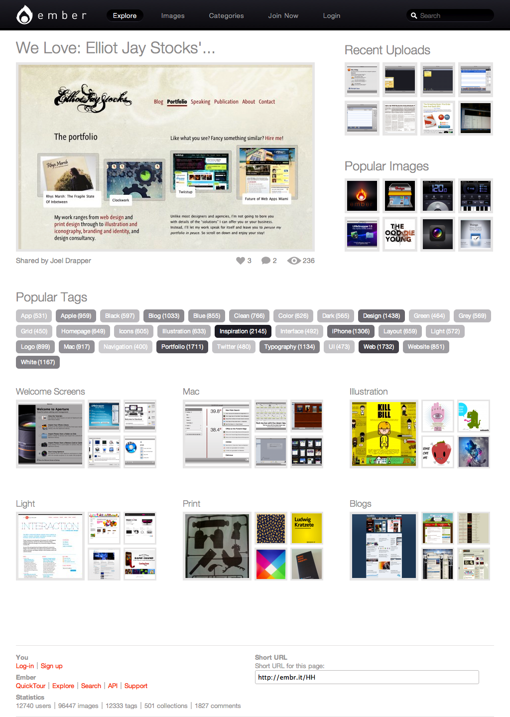
Explore Ember

The difference is in the content uploaded and the collections that people are making available. The ember homepage will highlight an image liked by the developers and also give you access to popular images, recent images and also access to to groups of images via tags and collections. The screenshot above shows the homepage and also the ability of LittleSnapper to snap the whole web page, not just what’s visible via the browser.

The content is of more interest. It’s more focussed on web and application design with an abundance of great looking websites and applications being highlighted by the Ember community. Since the update I’ve found Ember to be a great go to site for design idea’s, more so than anything I’ve found on Flickr. It’s also easy to browse around the site by collections, tag’s or user and can be a real time sink.

Ember is free to use and upload to but the free account is limited to hosting three online collections and 30 uploads per month. You also see adverts while using Ember but these aren’t intrusive and for me the free account is more than enough. The pro account costs $24.99 per year and allows unlimited uploads and collections, removes the adverts and also gives you free upgrades to LittleSnapper. It’s important to note that you can use Ember without LittleSnapper and it is well worth a visit if your interested in web or application on any platform.

There are many competing screen capture tools like Skitch, Voila and Snapz Pro but I found LittleSnapper to be one of the best. Used alongside Ember it makes for a great capture and design resource.

AppMiner 2.0

AppMiner2.0AppMiner 2.0, by Bitrino, monitors the App Store for apps which have been discounted or become available for free. With a layout very similar to the App Store, you can easily view all newly released apps, all on sale apps and all top rated apps. Each of these options can viewed by sub-categories or you can view the top 100 in each section.

The most useful section is of course, the Sale section. Here, you can view the on sale apps in specific categories. My most viewed category is Top 100. Apps in each category are displayed chronologically which really helps to see all the newest apps that have just come on sale. Each category can be changed to display just the paid apps, just the free apps or all apps..

My favourite feature however, is the Watch list. Here you can add a watch for any apps that you would like to purchase but can’t afford or don’t want to pay the current price. You can select a target price and if/when the app becomes available at or below your target price, it will be highlighted next time you launch AppMiner. This makes it really easy to keep a tab on your potential purchases without having to go to the App Store and individually searching for the apps to check their current price.

PS3 friendly videos with mkv2vob

The best tool I have found for converting your high-definition mkv files with x264 video and AC3 sound, to a PS3 friendly format is mkv2vob.
Previously I’d have had to transcode or convert the mkv file to an avi or other PS3 compatible video format, which would take ages and I’d lose the AC3 sound.
Mkv2vob simply muxes the x264/AC3 streams in the mkv file to a vob file, which is readable by the PS3. There is no transcoding or re-compression involved so there is no loss in quality. If the mkv includes DTS sound, then there is an option to transcode that to AC3, but my system can handle DTS so I leave it as it is.
The whole process takes literally minutes. Occasionally I have a file which does need to be transcoded and this does take longer than the regular process, but it happens so rarely that it’s not an issue for me. The good thing is that the user does not have to do anything, the program detects the type of the video source and automatically determines if any conversion is required.
Once the process has completed, an mpeg file is produced which can be played on your PS3, complete with HD video and surround sound – awesomes!

Parachute Panic

The iPhone has no shortage of great simple games. To stand out a game has to do something different or quirky while at the same time keeping the controls simple. Parachute Panic is very, very simple but due to it’s quirky graphics and sound offers something that will appeal to all iPhone owners. This video shows of the game well:

The aim is to land your parachutists safely on the boat. Helicopters, UFO’s and lightning clouds get in the way and using only your finger to control the wind you need to guide your guys to safety. The game plays really well but the hand drawn graphics and funny audio (think Flight of the Conchords) add so much to it that it’s hard to resist. A bargain at only 59p!

We Choose The Moon

To celebrate the 40th anniversary of the Apollo moon landings, We Choose The Moon has been set-up to remember, commemorate and also educate the current generation in what it took to get man to the moon.
WeChooseTheMoon

I’m not usually a fan of flash based websites but this is a rich and informative site that pulls together animations, video, radio and audio interviews to give a flavour of what took place 40 years ago. A great site if you are interested in space or for educating kids.

Geek it up with GeekTool

Something I’ve not done in a long time, especially after switching to Macs, is customise my desktop. I remember when I had a PC, I used to love tweaking the UI with apps such as WindowBlinds, IconPackager and ObjectDock. I’m reasonably happy with the Mac UI so haven’t had the desire to change much other than a slight tweak to the dock and the menubar icons. But this has all been done without resorting to any drastic changes or 3rd party apps.
Recently I came across GeekTool which is a system preferences module for OS X and can display system logs, unix command outputs and images on your desktop. This information can appear as embedded in your desktop or in front of other windows.
It’s a light-weight app and if used creatively, can allow you to enhance the already elegant OS X visual look. Once installed, it appears at the bottom of your System Preferences. It’s reasonably straight forward to use and you need to be familiar with unix commands.
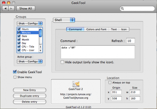
GeekTool
Groups are listed in a dropdown on the left. You create a group of as many elements as you like and only one group can be active at any one time. An element can be the output of a file, a unix/shell command or an image. Text output (from a file or command) can be formatted to any font, size and colour. When you add a new element, a semi-transparent placeholder for it appears on the desktop, which can be dragged around or resized with the mouse. You can also enter the precise size and coordinates in the window. There is also an option to always display this element on top of other windows.
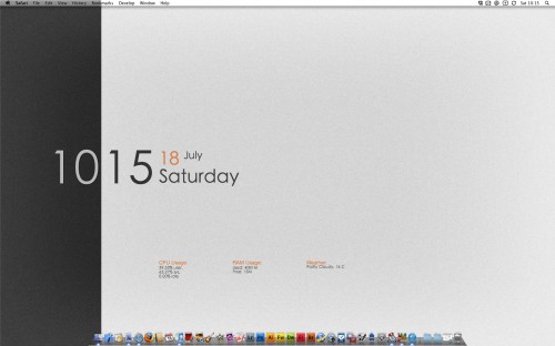
That is basically, all there is to it. The rest is up to the imagination of the user, how creative they want to get with it. Some examples I have seen display really nice weather output, including graphics. Whereas other examples are so geeked up, with massive file outputs covering the entire desktop, that it looks like a complete mess. I didn’t want to do anything drastic and followed the example from a LifeHacker article to create a nice desktop displaying basic information.
Desktop

Flogr

Flogr is a great web app that allows you to create a photo blog based on your Flickr entries. You download the application and install it in your web server. The configuration is pretty minimal – point it to your Flickr account and that’s about it. You then have a really nice photo blog set-up ready to be customised.

The theme is fully changeable via CSS so the look and feel is totally in your control. The real options are around the photo’s you bring back from Flickr. You can bring all, a set or filter via a tag. I’ve chosen the tag route as it means I can pick photo’s from any of my sets to display. The sites I’ve set-up can be found here. One issue is that the photo’s can take a while to load from Flickr so I intend to set-up a mysql database locally and store the photo’s there instead. You can also view sets and a tag cloud on your Flogr installation and by selecting a photo the metadata and comments from Flickr are displayed.

This is the solution I’ve always wanted – photo’s hosted on Flickr but key ones picked up and displayed on a separate blog. Lovely app that’s free to download and enjoy.