Myfitnesspal

My first pick of 2011 and it’s no surprise that it helps with one of the most popular New Year’s resolutions – dieting. Myfitnesspal is a web, iPhone and Android based weight/calorie tracking tool. It was first recommended by a friend last year and I immediately dismissed it as I hated the name and the web site design wasn’t the best. What a snob! Roll on a few months and at the start of 2011 I wanted to track more carefully my food intake. Partly to improve diet and partly to provide a food diary to help with migraine root cause analysis. After seeing myfitnesspal being recommended alongside RunKeeper I decided to look again at the service.
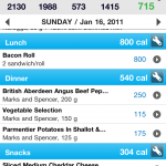
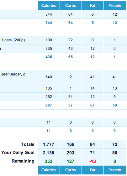
First good aspect of myfitnesspal is that it’s a totally free service. After downloading the iPhone app and creating an account the biggest plus of the experience so far was the capture of daily calorie intake. Myfitnesspal has a large database of foods that are easily searchable. It’s also stocked with lot’s of UK foods as well and it means a typical day’s food intake takes a couple of minutes tops to add in. The app also remembers foods you’ve previously eaten so if you are a Scot addicted to Frosties and Diet Irn-Bru (not at the same time I hasten to add) it takes seconds to add these in to the app. If a food doesn’t exist it’s fairly straightforward to add that to the database so it’s searchable from then on. Based on height, sex and weight myfitnesspal will display a daily target for calorie intake and guesstimate how your current intake will decrease, or increase, your overall weight. As I’ve only been using it for a couple of weeks it’s hard to say how accurate this side of the app is. However it really does hammer home how much you eat in a day to day basis. I’ve already switched a couple of foods to one’s with a far smaller calorie/fat/salt intake.

The app also allows you to track weight and exercise but these have to be manually inputted – no link up with other sites like Withings here. One interesting touch is that alongside weight tracking you can also track body measurements like neck size so you can see if you are staying static in weight but reducing fat/increasing muscle. The reports within Myfitnesspal are rudimentary and basic but allow you to see progress over time.

There’s also a social aspect in that you can have friends on the service but at the same time still keeping certain aspects of your profile private. I can see this being handy for people who are working together to encourage each other during weight loss but for me this is purely a solo adventure.

Overall I like the service myfitnesspal offers purely due to the functional rather than pretty front end making it easy to add data and the very complete food database. The fact it’s free is another plus point but I would be interested in hearing from anyone using a similar service that they would be happy to recommend.
Logitech HD Pro Webcam C910 Review

At the tail end of 2010 I picked up a webcam for use in daily video conferencing via skype. It would most likely have been sensible to plump for a cheap and cheerful option but somehow, as with all my buying decisions, I get like a kid in a sweet shop and can’t resist the big shiny option.

So, after some digging around and reading I plumped for the newly released Logitech HD Pro Webcam C910. A mouthful I think you’ll agree – so I’ll just call it the C910 from now on.

So why this buying decision? Well, I liked the top notch specs of this little camera. It’s got Carl Zeiss® optics, offers up full HD video recording, 10MP camera stills and has the capability to conference in 720P as well (although it requires a hefty internet connection to use this feature in reality.)

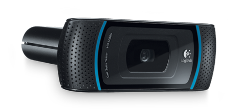
The head unit is long and oblong – about 3.5″ x 1.5″ – and has a flexible monitor support attached. I had no problem using the support to attach the cam to my 24″ Dell Flatscreen or my MacBook Pro Laptop. Obviously, being a fairly sizeable camera and the nature of a portable laptop, you’ll be wanting to have the laptop on a desk to make sure that you don’t catch the cable or otherwise yank the thing off the screen.

In operation, the camera is very capable. The optics are clear and the refresh rate is very good. The C910 offers auto focus that is quick and precise. I didn’t really notice it in operation, which is a good sign.

When in use, the camera has two led strips that light up blue. It’s a nice touch and looks sleek.

The software is relatively painless in use. Drivers are available for PC and Mac support was added recently. As far as I can tell, Mac is just drivers + the Logitech Vid HD software at the moment, whereas PC comes with some extras like options to install Skype, Vid HD as well as Magix photo and video editing software.

Also, it doesn’t appear at this stage that the Mac drivers come with the same filters and effects tools as the PC. Whether this is an additional download coming soon or whether this is a PC only feature, I don’t know at this stage.

I have to say that the facial recognition and tracking of the camera on the PC is impressive. A simple calibration tool sets things up and then you’re off. You can change yourself into an Avatar if you want and the facial tracking then transplants your mouth, eye and face movements onto another character. Just as impressive is the ability for the software to add 3D “features” to your face. Ever wanted to know what you’d look like with an arrow through your head? Well, now you can find out. As you move your head, the arrow moves in 3D space as well. Freaky voodoo fun!

In addition to these fun features, it’s possible to use the PC software as a motion tracker. Set things up and you can have your camera record snippets whenever it notices something moving in its sight line. You get to define the sensitivity of this feature and what it should do when it detects motion (record, alert you etc).

The basic system requirements are not onerous. 1GHz, XP and up or OSX 10.5, 512Mb Ram. However, things step up a notch when it comes to full HD conferencing. You’ll need a dual core processor, 2Gig Ram and at least a 1Meg upload connection. Most modern computers will meet the specs – but in the UK it’s really only the lucky few who have the luxury of 1Meg upload.

You’ll also need to download the latest version of Skype to make use of the HD capabilities of this camera fully (because who is really going to use Logitech’s own Vid HD in reality?). However, even if you’re not stretching this camera to its limits, the higher quality optics and hardware as compared to basic offerings mean that your video comes through bright, clear and updates quickly – well beyond other offerings I’ve seen in practice.

It copes well with light changes and differing light conditions and the stereo sound won’t win any awards but is plenty capable for Skype. It picks up the sound well and since moving to this as my main Skype Mic, I’ve had only positive response. If you let Skype auto change the gain, it can even pick up sounds downstairs when I go and make a cup of tea!

It’s biggest downfall is its price of course. Not because I think it’s over priced for what it is, just because it’s steep for a webcam. However, with it’s full HD recording ability, single click upload to facebook/youtube and 10MP still capability, it’s a whole lot more than just a webcam. I picked mine up for around £80. I’ve seen them since at around £70 and I’ve also seen a page on Amazon that looks as though it may get down to £60 in the next few months.

Withings WiFi Body Scale

As my current scales had become slightly inaccurate, it was the perfect excuse to pick up a Withings scale – the first wifi body scale. I’d been itching to get it since I first heard about Withings at the turn of the year but the main reason had always been the fact I had a perfectly good set of scales already. Also they cost a pretty penny – I paid £107 including shipping. Ouch. I’ve now been using them for over a week and it really is a lovely gadget.

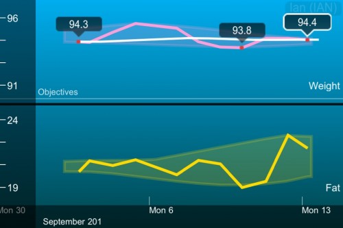
So as scales go, they look good but the really nice feature is that they are wifi enabled, automatically uploading your weight, fatty mass and BMI to the Withings website. The weight tracking works for up to eight people from one set of scales so your whole family should be covered. The website is Flash based and lets you track your weight and add notes when certain events (curry!) have impacted on your weight. So far, so good. There’s also a free iPhone and iPad app that allows you to track your weight from the comfort of your iOS device. These are pretty straightforward but give you everything you need to know.

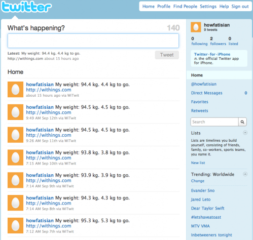
As it’s all automatic it means I can track my weight daily. Total overkill but it’s part of the new weight strategy – track all inputs and outputs. Track weight, exercise and calorie intake. Withings also make sharing information really easy with a number of options available. I can publish my data on the web via a link or an iFrame. I can also share my data with other users who can access via an e-mail address. I can also link Withings to a number of other accounts – Google Health, Runkeeper, even WeightBot on the iPhone. Finally, I can auto tweet my weight after each weigh in. No where to hide 🙂

It had to be done – a new twitter account has been setup just for my weight. Special. I’ve also hooked Withings into RunKeeper. I track all my hill walks on RunKeeper and also now track my efforts on the bike. Having all that info in one place plus the weight is really nice. Also, I’ve paid for one years access to RunKeeper elite which gives me more detailed graphs, stats etc.

The final piece of the jigsaw is to now track calorie intake. Couple of iPhone app’s are worth considering and I had myfitnesspal.com recommended so I’ll give those a try. The up shot of all that is that I’m a couple of kilo’s heavier than a year ago which isn’t too bad as I’ve not been doing the same amount of exercise this year. I’ll be stepping that up between now and Christmas so hopefully I’ll lose a little in the next couple of months – not long until Santa’s here now.

As for Withings – great gadget, expensive and a bit over the top but I love it.

The Photographer’s Ephemeris

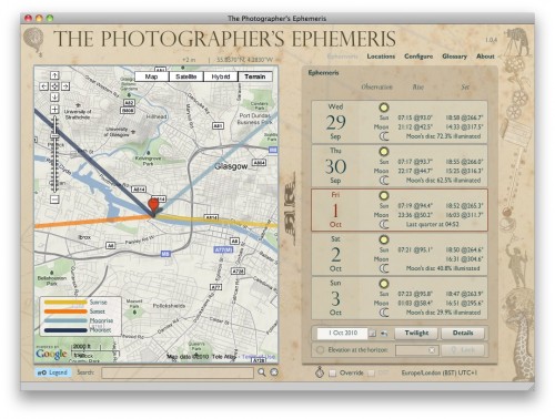
The Photographer’s Ephemeris is a great tool for landscape photographers. Using the tool you can pick a location anywhere in the world and work out not only the sunrise and sunset times but also the angle of the sunrise/sunset so if your wanting to plan a sunrise across a river or a mountain range you can work out the best time of year to do the shot.

Photographer’s Ephemeris is free and is an Adobe Air application so is multi platform. It’s easy to install and use and the results are great. Alongside the Air application a version has been written for iOS devices. This however is not free, currently retailing for £5.49 in the UK. This version is iPhone only at the moment but an update is coming which will move the application to being universal with iPad support.

The application is similar to the desktop version but I find it easier to use via the touch interface. Like the desktop version moonrise and moonset angles/times are also included alongside the ability to find out when the sun will appear from behind a hill – ideal for scouting out locations prior to a shoot.

It’s app’s like these that I find so compelling on mobile devices. Focussed, simple to use but very helpful.

Devour

YouTube is great as is Vimeo and all the other video sites on the web, but finding the good stuff in amongst the dross isn’t easy. For example, 25 hours of video is uploaded to YouTube every minute so what chance have you got? That’s where Devour steps in. They hand pick what they class as the best videos of the day and link to them from their site.

The site is simple to use – visit, click on a screenshot and watch the video. Customisation is limited in that you can change the background although in future you can tweak the layout to support lists or a full screen grid. All video’s selected are in HD too. This was an instant bookmark for me, not only on my desktop, but on the iPad and iPhone as all video’s work on iOS devices too. Awesome.

Quix

Some of our recent picks have been for online services that make use of bookmarklets. Google Reader, Boxee, ZooTools, Readability and Instapaper all make use of bookmarklets. This is all well and good but my browser bar is struggling under the weight of so many links. Thats where Quix step’s in.

Quix is an extensible bookmarklet. What’s that? It’s a bookmarklet (another one!) that allows you quick access to common internet commands and also allows you to extend it, adding in commands that you use often. So using Quix i remove many of the bookmarklets that I use day to day and access them via keyboard shortcuts. So how does it work.

At the most simple level, visit the Quix website, drag the Quix bookmarklet to your browser bar and your good to go. Want to do a google search for IMAX glasgow. Launch Quix and type:

g imax glasgow

Boom. A google search for IMAX and Glasgow will be run. I see that Avatar is on. To get some info Quix can help again

imdb Avatar

I now have the IMDB page for Avatar. This time I ran the search with a space in front of the command. This opened the search in a new tab in Safari. I want to save that page for reading later. Open Quix and type

evernote

The current page is saved into Evernote. The list of commands on the Quix site shows a full list of all the sites and services supported. It’s extensive and ever growing. One awkward step is launching the Quix bookmarklet. Having to select it with a mouse and then typing feels a bit sluggish. On Safari, there is a keyboard shortcut to launch shortcuts on the bookmark bar, so clicking CMD+1 will launch Quix if it’s the first bookmark in the bar. Very nice. Chrome and Firefox via an extension allow for shortcuts to launch Quix as well – see the Quix website on how to setup each browser.

So far so good. It’s easy to see what a time and space saver Quix can be. The feature I like the most though is the ability to add your own commands. The syntax page details how to add your commands but basically you create a text file that is hosted somewhere – Dropbox, MobileMe or your own webspace for example. You then add commands in the format “shortcut executable description”. The executable can make use of the following replacement tokens:

%s Replaced by any search terms that were entered after the command and / or any text that was selected when the command was issued. There’s a special case of this: %s_, this does the same except that it replaces spaces with underscores ( _ ) instead of plus signs, this is used in the Wikipedia command in the example file.
%r Replaced by the URL you were on when the command was issued.%rsReplaced by a bit.ly shortened version of the URL you were on when the command was issued.
%d Replaced by the domain you were on when the command was issued.
%t Replaced by the title of the page you were on when the command was issued.

So its very easy to add commands. Before you can use the commands you need to create a new bookmarklet that calls your custom file – visit the extend page to create the new bookmarklet. That’s it – your good to go. One issue I did have is that it can take a while for the bookmarklet to pick up new commands added to your custom file. To get around this open Quix and type ‘debug’ which clears the cache and reloads the custom file.

If your interested in my custom command, it can be found on Github. This is a fork of Merlin Mann’s original file which contained some very useful commands.

Hopefully you’ll read this an install Quix as it is incredibly useful especially when you start to customise what it can do. if your still in doubt, watch the screencast below demoing Quix from the developer himself.

An introduction to Quix from Joost de Valk on Vimeo.

Unison 2

When I moved to the Mac platform a few years ago one area of software that wasn’t well supported was newsgroup readers. There was a few but the one that stood out was Unison from Panic Software. Early in January they announced Unison 2 and I was surprised – what could they really do to justify an upgrade?

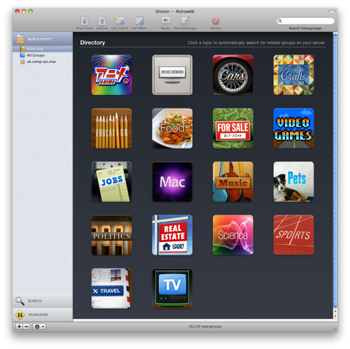
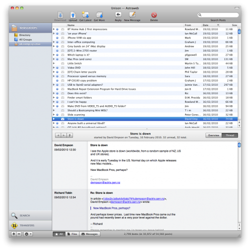
The first aspect they have addressed is making the textual world of newsgroups far more visual. Instead of seeing 1000’s of groups to browse with you can select a group o groups via the Directory. This then lists all music groups for example or all Mac groups. You can then a select a group and Unison will download the latest headers for you to browse and read. You can also subscribe to a group and each time you launch Unison it will update the groups with the latest content.

You can also use All Groups to step through the different groups available or just use the search facility. Type in a search string and all groups that match the string will be returned. Easy and fast. Newsgroups are really just lots of text messages but have been used for years to carry binary files as well. If you want to use newsgroups as a messaging platform then Unison helps with good support for threaded messages, messages updated on launching the app and a clean, clear interface. You can also reply in HTML (boo) or plain text (yah!) to messages so all formatting options should be covered.

Despite the nice messaging features most people will want to download from binary groups and Unison 2 has some nice upgrades in that area. First of all, browsing group messages will actually display pictures and music files directly in Unison rather than seeing 10’s or 100’s of text messages. You can even play the music from within Unison but to be honest this isn’t the best way of using Unison. It supports NZB files which makes downloading files as easy as using a search engine. NZB is an xml based file that groups together message ID’s for a particular file or set of files. So if I wanted to download the latest episode of Lost, instead of searching for and selecting 1000’s of messages I search for and download one NZB file which unison use’s to grab the correct messages.

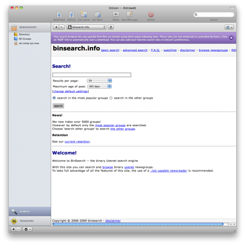
Once the messages have been downloaded, Unison 2 will now extract the files, use PAR files to repair any broken files and then clean up the PAR and ZIP/RAR files when the file has been extracted. No need for any helper app’s as Unison does it all. Another new feature is the Search Browser which connects to popular NZB search engines and allows you to search and download NXB files form within Unison rather than an external browser or search tool. You can customise the search engines used so if you have a favourite site or paid for access to one of the private search engines then you can use it as well.

In use I’ve found it to be fast and reliable and the new features have really added to the usability of the application. Unison 2 costs $29 for one licence or $18 for an upgrade form version 1. I think that’s a bargain for the functionality you get in return. If you are a heavy binary newsgroup user then another option is SABnzdb which is a cross platform binary newsgroup reader that doesn’t have a GUI but once setup is very powerful and offers a number of scriptable and customisable features but for my occasional toe dipping into newsgroups, Unison 2 is my tool of choice.

Readability

I read much of my web content in Google reader. However for an interesting or longer article I still prefer to click through to the articles website and read it in situ, mostly to read through any associated comments or make my own. More and more sites though are cluttered with links to other articles, tag clouds and adverts. Especially adverts that flash, move and distract from the actual article content. Step forward Readability. A summarised on their website:

Readability is a simple tool that makes reading on the Web more enjoyable by removing the clutter around what you are reading.

To setup Readability, visit the website and select a Style, Size and Margin. Then drag the bookmarklet to your browser bar. When your on a website and the clutter is distracting click on Readability. Take this TUAW article for example.

Small text, distractions in the right hand column. One click with Readability and it’s clutter be gone.

I now have a clear distraction free article with images preserved. Much easier to read. The buttons to the left hand side allow me to swap back to the true website view of the article, and taking advantage of the cleaner page, I can print the article or e-mail the article on to friends and colleagues without the normal distracting content being e-mailed at the same time.

Another use of Readability is when it comes to note taking. I capture a lot of web content in Evernote for future reference. By default the snippet tool can capture a whole page or selected text. I prefer to use a bookmarklet that first sets up a Readability view of a web page and then invokes the Evernote web clipper to capture the article and sync it to my Evernote account. The result is a far cleaner set of notes.

If you want a bookmarklet to do both then take a look at this Evernote forum post. I hope you find Readability as useful as I do – certainly makes for a more readable web.

AppZapper 2


Appzapper 2 is my pick this week and is an uninstaller application for Mac OS X 10.6, with a number of extra features that make it well worth a look.
There are a number of other uninstallers available for OS X. I’ve been using the excellent AppCleaner on my mac for some time now, and when such a good utility is available for free why would anyone buy Appzapper at $12.95 ?
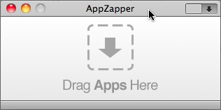
Appzapper is a lovely looking app, with a simple switch to toggle between the basic initial view to the main view.

.
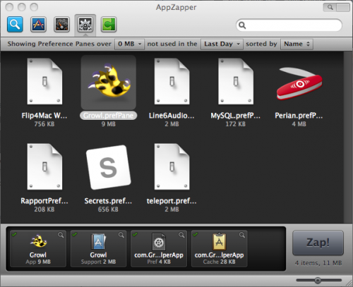
It not only shows all your installed applications, but has options to show only those apps that haven’t been used for a selected time period. Very handy when you’re trying to decide if you should keep an app or just zap it with the extremely satisfying sound effect. In addition to applications, Appzapper also tracks widgets, preference panes and plugins.

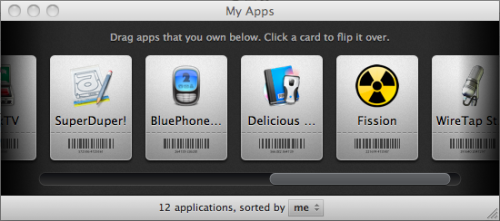
For me though, the great new feature in version 2 is the “My Apps…” window.

This is where you can drag apps onto the window, click the image and enter the licence info on the back. It would be great if you could import this info from a file as it can be a bit tedious to go through all your apps manually, and I did have some issues with some strange input methods for the date field, but these are minor gripes and ‘My Apps’ is an unexpected but welcome addition.

All in all it’s a great little utility.

Appzapper 2 is a free upgrade from version 1 and the Appzapper website is http://www.appzapper.com,

Dterm

One of the great things about Mac OS X from the Geek perspective, is the Terminal.app.  It’s a simple Command Line Interface that exposes the Unix like operating system underpinning the glorious eye candy which Apple are more famous for.

Your mac works perfectly well without you knowing a gnats dropping about the terminal, and Mac users unfamiliar with  *nix are often a little overawed when they first encounter it.  But many of the more technical users love the terminal and the things they can d that aren’t available to the uninitiated.

If you are a die-hard terminal lover, then you really need to download dterm from decimus.net. It’s very simply a context sensitive terminal window with the working directory set to your current window. It appears when you press a hotkey.

For a developer using a version control system like git, using Dterm this is a huge boost to productivity.