I’ve been using the Google Nexus S for a few weeks now. It comes with Andriod 2.3 (Gingerbread) but as I’ve never used the Android operating system before, I have no idea how much of a leap 2.3 is above what has gone before.
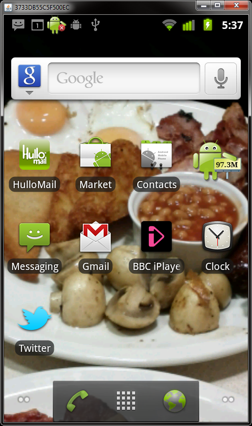
The first thing you realise when you get to using the phone is that there are some additional concepts to get used to over and above what you’re used to on iOS. Firstly, the screen you are presented with is different on Android than it is in iOS. On iOS, your initial screen has the now familiar grid of application icons. Press on an app, and it launches. Get more apps than there is space on a page and you get to create more pages. However, Android adds a layer of customisation over the top of the apps screen. You can access your apps by clicking on a small grid icon that stays at the bottom of the screen when not in an application.
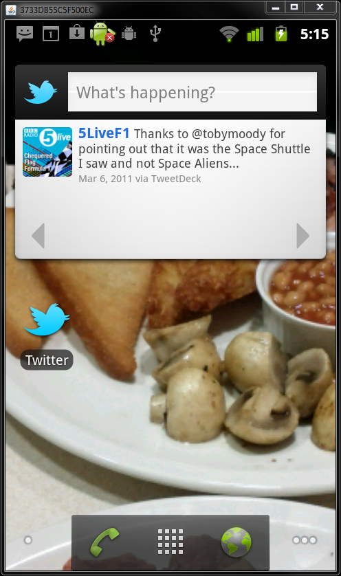
Android’s home screens are available for you to customise as you see fit. In practice, this means that you can “pin” shortcuts to your favorite apps to the screen, but you also have the option to pin “widgets” to the screen as well. These widgets are generated by applications and enable you to add live functionality to your screens. It’s probably easier to explain this with a few examples. And for this example, I’ll use Twitter.
When you install the app, it appears in your app screen, but it’s also possible to pin the icon for the app onto your home-screen. But you also have the option to add twitter as a live widget to the screen. This live widget shows the latest tweets in your stream right on the home-screen, without the need to launch the app. This home-screen idea is really nice in reality – it a little less obvious for a new user. It makes it possible for you to get quick updates without the need to load up applications.
The other major concept that’s different on Android, is the addition of more buttons! OK, so these buttons are only soft-buttons on the Nexus S, but you get a back button, a menu button, a search button and a home button. These are contextual, and apps may use them for what ever makes sense within the app. So, the back button in the browser will take you back through your history. If you open a dialogue box, it offers a way to close that dialogue without having to submit etc. The menu hides away customisable features of apps in a nice consistent place. You don’t have to go back to global settings like you do on iOS and the added flexibility that these simple 4 buttons adds is refreshing – even if it does take a short while to get used to their availability!
The Android OS has the concept of multi-tasking built right in. In fact, it’s the hardest to grasp concept that’s introduced. When you have ultimate multi-tasking flexibility, it means that everything gets just that bit more difficult to feel in control of. Apps will routinely set themselves up a background process that can be exceptionally useful, and powerful. However, it also gives you the feeling that you don’t really have a say in what’s running and what’s not. I can completely understand why Apple were so reluctant to offer this ability and why, when they did, they did it in a restrictive way. However, once you learn how to kill running tasks, the additional multitasking ability of the handset is great. I’ll be looking at useful applications in a future article, but there will certainly be a task killer as one of those applications!
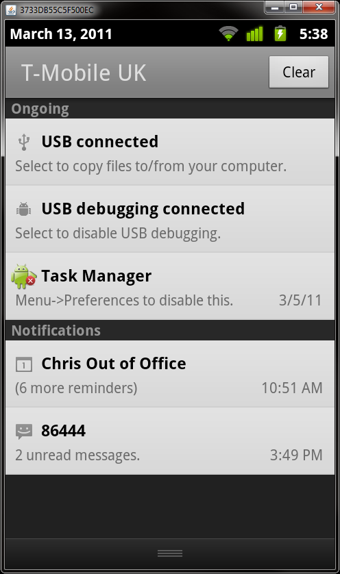
Notifications in Android are also very flexible. All notifications appear at the very top of the screen. You get an audio cue every time a notification takes place and these can take on any number of forms. Essentially, it’s up to the applications to define notifications. In practice, you’ll receive messages for text messages, missed calls, voicemail, email and the like. If you turn on push notifications in apps, then you’ll receive these as well. However, this is something that I quickly disabled – for two reasons. Firstly, it gets manic! I was finding too much going on with a bong every time that you get an email, tweet mention etc. It’s distracting. Secondly, turning off push notifications also means that you save on your battery life! With notifications on, it seems that the constant chatter between your phone and the network sucks the phone dry. Not unsurprising really as the network radios are probably the most expensive as far as power goes. With notifications on, battery life was around the day that I was used to on my old 3GS. Accidentally not charge it and you’d be in trouble the following day. However, with notifications off, I have found the battery life to be excellent. Perhaps 3 days of light use 4-5 days if not really pushing things too much.
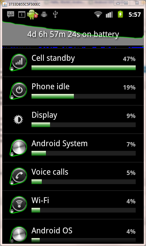
I’ll normally stick it on charge every other day now just to be safe if I need to nip off unexpectedly. The GPS also seems less power hungry in Android. It will happily take a couple of hours a day of use without really making a noticeable impact on battery life. Another lovely feature of the operating system is the ability to see exactly what has used your battery and for how long. Nice eh!
So, a summary then. My experience has been one of familiarity with basic concepts. They remain largely similar across iOS and Android. Pressing an app icon opens an app. Pressing home takes you have to your home screen. However, the additional flexibility of the Android OS means that there are a lot more settings hanging around that are your responsibility to look after. It takes time to feel like you control your phone and understand what it’s doing. However, with time, that feels more open, free and flexible. For a willing geek, it’s a great thing. For a retiring technophobe, it could be more than a little intimidating.
Next up in the series will be a look at applications on the Android OS – covering some great utilities that all Android owners should really have installed.


