I read much of my web content in Google reader. However for an interesting or longer article I still prefer to click through to the articles website and read it in situ, mostly to read through any associated comments or make my own. More and more sites though are cluttered with links to other articles, tag clouds and adverts. Especially adverts that flash, move and distract from the actual article content. Step forward Readability. A summarised on their website:
Readability is a simple tool that makes reading on the Web more enjoyable by removing the clutter around what you are reading.
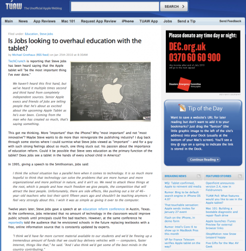
To setup Readability, visit the website and select a Style, Size and Margin. Then drag the bookmarklet to your browser bar. When your on a website and the clutter is distracting click on Readability. Take this TUAW article for example.

Small text, distractions in the right hand column. One click with Readability and it’s clutter be gone.

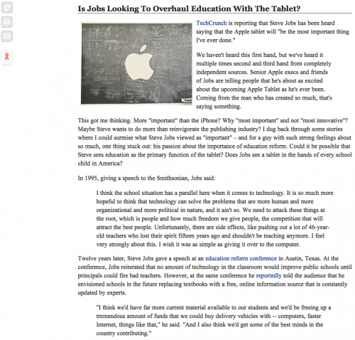
I now have a clear distraction free article with images preserved. Much easier to read. The buttons to the left hand side allow me to swap back to the true website view of the article, and taking advantage of the cleaner page, I can print the article or e-mail the article on to friends and colleagues without the normal distracting content being e-mailed at the same time.
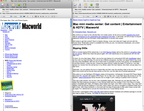
Another use of Readability is when it comes to note taking. I capture a lot of web content in Evernote for future reference. By default the snippet tool can capture a whole page or selected text. I prefer to use a bookmarklet that first sets up a Readability view of a web page and then invokes the Evernote web clipper to capture the article and sync it to my Evernote account. The result is a far cleaner set of notes.

If you want a bookmarklet to do both then take a look at this Evernote forum post. I hope you find Readability as useful as I do – certainly makes for a more readable web.