Take a look at a quick video of the Android OS in operation…
Category: Android
iPhone to Android Part 3: Operation
I’ve been using the Google Nexus S for a few weeks now. It comes with Andriod 2.3 (Gingerbread) but as I’ve never used the Android operating system before, I have no idea how much of a leap 2.3 is above what has gone before.
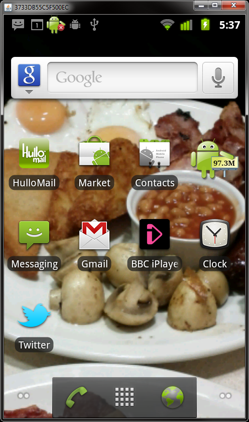
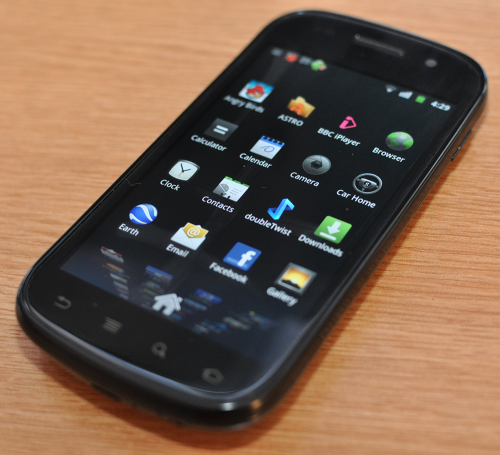
The first thing you realise when you get to using the phone is that there are some additional concepts to get used to over and above what you’re used to on iOS. Firstly, the screen you are presented with is different on Android than it is in iOS. On iOS, your initial screen has the now familiar grid of application icons. Press on an app, and it launches. Get more apps than there is space on a page and you get to create more pages. However, Android adds a layer of customisation over the top of the apps screen. You can access your apps by clicking on a small grid icon that stays at the bottom of the screen when not in an application.
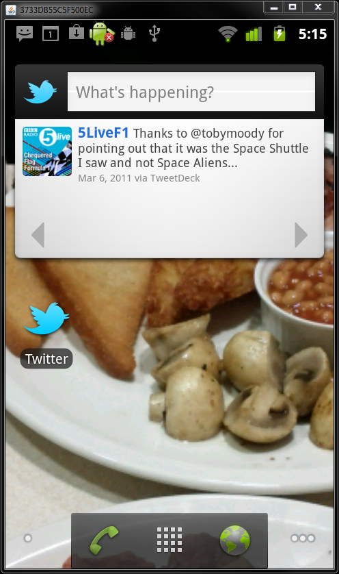
Android’s home screens are available for you to customise as you see fit. In practice, this means that you can “pin” shortcuts to your favorite apps to the screen, but you also have the option to pin “widgets” to the screen as well. These widgets are generated by applications and enable you to add live functionality to your screens. It’s probably easier to explain this with a few examples. And for this example, I’ll use Twitter.
When you install the app, it appears in your app screen, but it’s also possible to pin the icon for the app onto your home-screen. But you also have the option to add twitter as a live widget to the screen. This live widget shows the latest tweets in your stream right on the home-screen, without the need to launch the app. This home-screen idea is really nice in reality – it a little less obvious for a new user. It makes it possible for you to get quick updates without the need to load up applications.
The other major concept that’s different on Android, is the addition of more buttons! OK, so these buttons are only soft-buttons on the Nexus S, but you get a back button, a menu button, a search button and a home button. These are contextual, and apps may use them for what ever makes sense within the app. So, the back button in the browser will take you back through your history. If you open a dialogue box, it offers a way to close that dialogue without having to submit etc. The menu hides away customisable features of apps in a nice consistent place. You don’t have to go back to global settings like you do on iOS and the added flexibility that these simple 4 buttons adds is refreshing – even if it does take a short while to get used to their availability!
The Android OS has the concept of multi-tasking built right in. In fact, it’s the hardest to grasp concept that’s introduced. When you have ultimate multi-tasking flexibility, it means that everything gets just that bit more difficult to feel in control of. Apps will routinely set themselves up a background process that can be exceptionally useful, and powerful. However, it also gives you the feeling that you don’t really have a say in what’s running and what’s not. I can completely understand why Apple were so reluctant to offer this ability and why, when they did, they did it in a restrictive way. However, once you learn how to kill running tasks, the additional multitasking ability of the handset is great. I’ll be looking at useful applications in a future article, but there will certainly be a task killer as one of those applications!
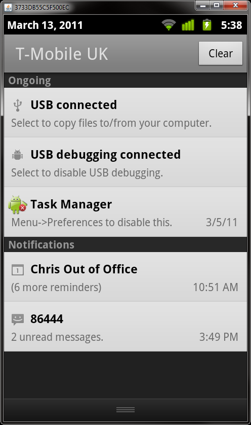
Notifications in Android are also very flexible. All notifications appear at the very top of the screen. You get an audio cue every time a notification takes place and these can take on any number of forms. Essentially, it’s up to the applications to define notifications. In practice, you’ll receive messages for text messages, missed calls, voicemail, email and the like. If you turn on push notifications in apps, then you’ll receive these as well. However, this is something that I quickly disabled – for two reasons. Firstly, it gets manic! I was finding too much going on with a bong every time that you get an email, tweet mention etc. It’s distracting. Secondly, turning off push notifications also means that you save on your battery life! With notifications on, it seems that the constant chatter between your phone and the network sucks the phone dry. Not unsurprising really as the network radios are probably the most expensive as far as power goes. With notifications on, battery life was around the day that I was used to on my old 3GS. Accidentally not charge it and you’d be in trouble the following day. However, with notifications off, I have found the battery life to be excellent. Perhaps 3 days of light use 4-5 days if not really pushing things too much.
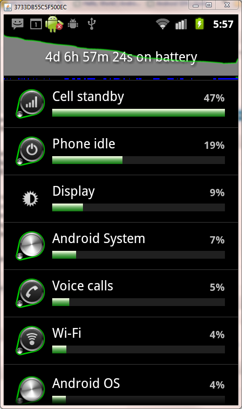
I’ll normally stick it on charge every other day now just to be safe if I need to nip off unexpectedly. The GPS also seems less power hungry in Android. It will happily take a couple of hours a day of use without really making a noticeable impact on battery life. Another lovely feature of the operating system is the ability to see exactly what has used your battery and for how long. Nice eh!
So, a summary then. My experience has been one of familiarity with basic concepts. They remain largely similar across iOS and Android. Pressing an app icon opens an app. Pressing home takes you have to your home screen. However, the additional flexibility of the Android OS means that there are a lot more settings hanging around that are your responsibility to look after. It takes time to feel like you control your phone and understand what it’s doing. However, with time, that feels more open, free and flexible. For a willing geek, it’s a great thing. For a retiring technophobe, it could be more than a little intimidating.
Next up in the series will be a look at applications on the Android OS – covering some great utilities that all Android owners should really have installed.
iPhone to Android Part 2: Infrastructure
Whatever you think about Apple, you have to admire their wholesale approach to their product line. As many arguments as there are against the all encompassing combination of iDevice + iTunes, it means that Apple control everything about their products from start to finish and this control gives them the ability to direct the user experience fully.
It may sit uncomfortably when they make decisions that you don’t agree with, but the strength is that, so long as you don’t want to use your device outside their software/hardware combination, everything is sorted for you. You don’t need to make decisions about where you store your music – it’s got to be iTunes. You don’t get a choice of where to make payments – it’s through Apple. You don’t get a choice of where to get your Apps from – it’s through the App store.
You become embedded and, more importantly, invested in the Apple way. If you keep on the Apple upgrade path, all of that investment stays with you. Move away however and it’s all gone. You can’t sync your iTunes library using iTunes with your other devices. You don’t get to take your Apps with you. This is the reason that it feels such a big step to move away from the Apple fold.
So, let me outline the infrastructure that I have come to use on my iPhone 3G and those aspects that I have aimed to recreate on the Nexus S.
- Music Library Syncing
- Podcast search/subscription/download/syncing
- Car holder
- FM Transmitter to play music through car speakers
- Sat Nav
- Applications (Key and supplemental)
- Music purchase
Let’s deal with the first 2 items first. Android doesn’t come with the pre-requisite of sync software installed on your PC. You can simply copy over your music collection files to your device. However, although I hate the BloatWare that is iTunes, I do love the fact that it lets me keep my music in sync and especially rely on the ability to subscribe to podcasts and have all un-listened to episodes synced to my phone. This was one area therefore that I was particularly worried about in the move from iPhone to Android. However, where needs arise, there are always those willing to fill the hole. And so in steps doubleTwist.
doubleTwist is effectively iTunes for all devices outside the Apple empire. It keeps things refreshingly simple. It allows you to connect up your device as a USB storage device and then sync your iTunes library/Windows media library onto your phone. It offers options to sync specific playlists or your whole collection. It allows syncing of your photos and videos as well. The software deals with any necessary file conversion to ensure your media plays OK on your phone. A solution then! Indeed.
It has been working well for me over the past few days with very few problems… apart from not being able to play DigitalOutbox through the in-built player on the desktop! Oops.
However, the story doesn’t end there. doubleTwist also integrates with the Android Market for apps and, if you live in the US, the Amazon MP3 store and as well. Apparently they are looking to have a UK MP3 store in place in the future. They have a free doublTwist player for your device and, if you’re willing to part with £3.10, you can also have AirSync and sync to your phone without the need to tether your device! The choice is yours, and isn’t it nice to have that choice!
The lack of integrated MP3 download isn’t such a big deal in reality as the UK Amazon MP3 store is easily available via the web and also as an app on the phone should you wish.
Straight away then, with doubleTwist things start feeling more like your iPhone you’ve walked away from. Perhaps going forward, this method of syncing will seem over engineered and drag-drop will seem more sensible but in this transfer period, it’s nice to have similar methodologies to rely on. There may be alternative software out there but as I hit on this on my first search and it did what I wanted, I haven’t really looked around more!
We’ve already ticked off a good selection of the infrastructure with doubleTwist. But how about car use? With my iPhone, I had a lighter mounted Belkin FM Transmitter II which combined the ability to hold the phone, charge as you travel and also output the audio to the stereo (as my car doesn’t have an aux in.)
When it comes to accessories, the iPhone is king. With the Android market being split over so many different devices, the accessories are far more limited. There isn’t an equivalent FM Transmitter/Holder for the Nexus S yet so, instead I have had to look for separate solutions.
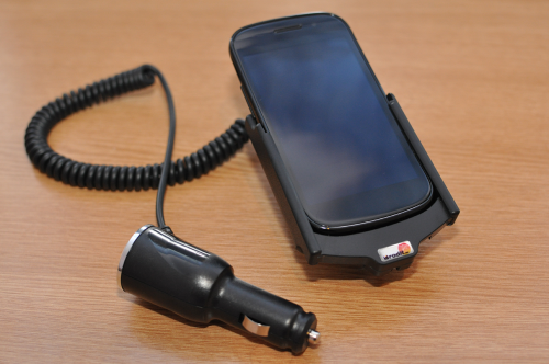
When it comes to holders, my go-to manufacturer is Brodit. They make great attachments for an incredible variety of cars (Brodit Pro Clips) and these offer a solid platform into which to screw in their range of holders. To get the charging up and running, I’ve gone for an active holder, which plugs into the lighter socket in the car.
The best deal I found online was with www.mobilefun.co.uk and as their online reviews where very positive – they were a good bet. Great website and service so top marks from me as well although I would have liked to see the holder packaged up a little more. The holder is sturdy and the Nexus S slips in and connects with the charging port without issue. I would have liked the charging cable to be slightly longer, as it is a little bit of a stretch for my placements but it’s not a show stopper.
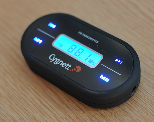
That leaves the FM Transmitter to get the device sound through the car speakers. I’ve had very mixed experience of FM Transmitters. The FM band is so crowded with stations that it is almost impossible to get a clear signal to transmit your content on. Normally, holding the signal at the extremes of the band is most successful. There are some exceptionally cheap devices out there, but they come with certain quality issues. You can’t go too far wrong with them as they don’t cost any real money (the cheapest come in at £5 or so). Still, I’ve given myself a little more chance for a longer life device and also got some neon blue lights by going with the Cygnett GrooveRide Touch.
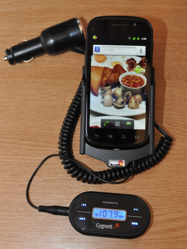
It plugs into the jack out of the phone, and the Brodit holder leaves a small grove in the base of the unit, just enough to get the small end of the 3.5mm jack supplied with the GrooveRide though. When the phone is in the holder, it is a little fiddly to get the jack in the audio out but not a huge issue.
In practice, the sound you get through the stereo is adequate. There is more hiss on the the GrooveRide than there was with my Belkin and the band extremities were a little wider as well, giving a clearer spectrum to use. For Audiophiles, the hiss will be a game stopper. I tend to listen to podcasts in the car, so it’s not such a biggie. As ever though, a car stereo with an Aux in is a much better bet overall.
Navigation on Android devices is a no-brainer. Android (in its more recent forms) comes with in built Google navigation that’s free. It hooks into Google maps data (now vector based on Ginderbread) and voice is computer generated. In practice, the Nexus S picks up GPS extremely quickly and there were no issues with typing in locations – and because it hooks in with Google data, you don’t have to know postcodes, you can type locations – even down to specific pubs / attractions. I did have a little play with trying to use the voice control features – where you just tell your phone to “navigate to …”. However, I didn’t find this particularly accurate, even when I tried to use my bestest talking. I will look more into the voice aspects of the phone in the future to see if there’s a way to make things more accurate.
As the navigation is cloud based, you do need a data connection to make the most of the service, although the move to vector based data does mean that there is potential to store your route when you have a connection and use this cached version if it drops. I haven’t tested out/researched these capabilities but I had no problems during the real-world testing I did.
The last piece of my infrastructure puzzle is that of apps and software. I am going to cover this in another part of the series so watch this space!
Day 1 with the Nexus S: Hardware
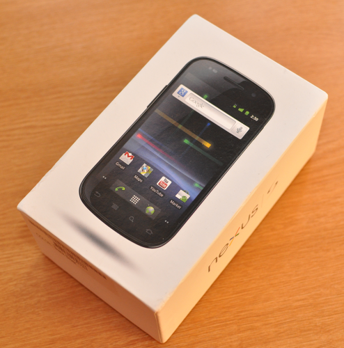
It’s here! In a nice, crisp white box, stuffed in a cruddy DHL delivery bag and dropped off at the door by a man in a Peugeot 206! DHL… delivering via an ancient hatchback? Strange indeed. But still, that was all forgotten with the excitement of getting my grubby mit on a new piece of hardware.
Not only hardware of course, but software as well.
So, lets start this series off by taking a once over on the hardware. I don’t really have a frame of reference for hardware outside of the iPhone – so I will have to compare it to that and I suspect that most would agree that the iPhone is the best kit to compare it to for the purposes of this series.
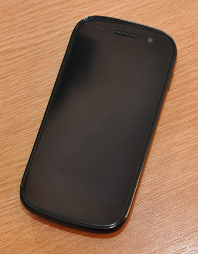
Without being turned on, the Nexus S has an amazingly dark look. The inactive screen is almost completely black and is indistinguishable from the surround. This gives an almost seamless look to the gently curving front screen. The reverse of the phone has a slight pattern to it, almost mock carbon fibre. It also has a slight bump at the bottom of the phone making it easy to grip in the hand.
The case is unmistakably plastic. That shouldn’t really be read as “cheap feeling” as it is a solid device, however, like a heavy watch always reassures you there’s a good mechanism below the surface, you might expect to feel a little more weight behind this device.
One advantage of the plastic and the shape of the phone, is that it is very easy to keep hold of! I’ve had my iPhone slip out my hand on a couple of occasions due to it’s sleekness and I can’t see this happening with the Nexus S.
Things really start to sing with the device once you turn it on. It has a AMOLED screen that absolutely screams at you with it’s vibrancy, resolution and unbelievable contrast. I realise that many other devices have got AMOLED screens and as such, this is nothing new, but this is the first time I’ve seen one properly in the flesh for any length of time, and it’s got me sold. It’s not as high resolution as the iPhone retina display, but it’s not a long way off. The blackness of the phone and the darkness of the new look of Gingerbread mean that everything just pops out and the icons seem to float in nothingness!
The live desktop is a nice effect, with moving walpapers to keep things interesting. I’ll go onto giving an initial impression of the software in another article so I’ll try not to get too sidetracked at this stage.
Digging into the phones settings, you’ve got all the fancy equipment everyone has come to expect. GPS, Wi-Fi, Bluetooth, Compass etc. So, as with the iPhone, the device can know where it it, at what angle and where and how it’s moving. The Nexus S adds Near Field Communication (NFC) to the parade – a communication for reading tags embedded in other objects. Think of the Oyster cards and some new credit cards. Also, know that it won’t really be a big deal for a good while yet. Probably until the iPhone gets it’s own NFC chip!
Also in the setting are options to turn the Nexus S into a mobile hotspot or to tether it to your laptop. For all the per-lava that surrounds this feature on iPhone and on mobile devices generally, it’s so refreshing to have an unfettered offering with all the extras available. This will surely be the first feature to be turned off by carriers when the next Gingerbread devices are available.
The in build speaker in the Nexus S is disappointing. The iPhone speakers – or device speakers per-say – are not that strong in general, but this speaker is particularly weak. The sound output of the phone through the jack socket is also low. I have to crank my speakers in the kitchen right up to get some decent levels whilst doing the washing up. The in-ear buds are fairly comfy for my ears (much better than the white Apple buds.) The sound is better through the earphones as you would expect and the volume is less of an issue, but I’m used to devices being able to blast you to smithereens if you so wish, and you can sit with the volume at full with no issues.
The phone is the right size. There are lots of devices out there that are getting bigger… getting on for comical. The Nexus S is nicely pocket sized and positively mobile.
So, an encouraging start with the device. Sound aside, everything feels nice and solid. Wi-Fi has been good enough across the house and the phone hasn’t struggled with any of the trials I’ve subjected it too so far. In fact, it’s been pretty faultless and very snappy. Comparing it to my creaking iPhone 3G is night and day. I’m confident that iPhone 4 users would appreciate a comparable speed of operation.
In the next part of the series, I’ll be looking at setting up the phone infrastructure – how can you recover the ability to sync your music collection and podcasts? What accessories are available? How do you get to use your phone as you are used to?
Jumping in bed with an Android
OK, so since the beginning of the year, I’ve been harping on about how now is NOT the time to buy new phone. Well, I still say that is exceptionally prudent advice, with a lot of new Android devices on the very near horizon and also the new iPhone announcement coming along very soon.
But when has good advice ever taken precedence over impatience?
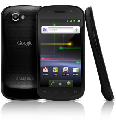
I cracked. Like Humpty Dumpty perched on top of a wall, it was inevitable really. It was a late night decision, but now on route to my humble abode is a shiny new Google/Samsung Nexux S. It should be here by tomorrow.
What I am convinced of, is that this is the right decision for a geeky mobile buyer right at this second, what I am yet to know, is whether the comfortable surroundings that Apple lays on with it’s iOS infrastructure is going to be missed, when it appears that you very much have to buy your own furniture with Android. Also, over the next couple of months we’ll hear all sorts of speculation on the new iPhone and then finally be marginally disappointed with it’s final offering. However, it will still be a mighty device no doubt, and it was what I was trying to tell myself to hold on just a few more weeks for.
But no. I’ve now plunged headlong into a 24 month contract with a new carrier and a brand new device and operating system. All my existing infrastructure that goes along with a smart phone these days (car holders, application purchases, computer setup, data syncing) will likely need tweaking or changing wholesale.
It’s going to be an interesting time. One that I am really looking forward to as it happens. And also one that I will document here on DigitalOutbox. There are many people out there in a similar position, perhaps looking to extract themselves from the all encompassing iPhone and I hope that this new series will highlight the plusses and minuses along the transition.
