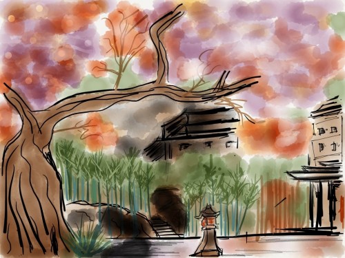
Paper is a new sketch and note taking iPad app from FiftyThree. Considering the iPad is two years old it’s a later addition to an already saturated market so whats marks out Paper when compared to the other sketch tools? Simplicity.
Paper is free and is well worth downloading. You can have a number of sketch books, the only customisation option being the name and cover photo of the book. Touch on a book to open the book in a coverflow view of the pages. Swipe through the pages and when you reach a page you want to edit touch on it. You will be presented with a blank page. No lines, no toolbars. Just one default tool that allows you to draw on the page. Swipe up from the bottom of the screen to open the tool tray which allows you to select from one of 5 tools and only 9 colours.
Although the app is free it only comes with one tool – Draw. To use the other tools which are Sketch, Outline, Write and Colour you need to buy them individually or buy them all for a slightly reduced price (around £5 from memory). Initially I thought that was slightly rude but it’s a great model that I’m surprised more tools don’t adopt. One really nice feature is a 20 step undo/redo. Place two fingers on the screen and rotate anti-clockwise to step through recent changes and undo them, rotate clockwise to reinstate them. Simple and effective. You also have access to an erase tool but thats it – a very clean environment that leaves you free to concentrate on your notes rather than how to use the tool. The video below from FiftyThree highlights the key features.
It’s easy to add a new page within a book and to move back to the home screen, select a new book and cary on sketching. Paper has limited but very clever sharing features. You can share a sketch on Tumblr, Facebook and Twittter or send via e-mail. I was surprised by how limited the options seemed to be – no way to save to image folder for example but you can just take a screenshot and share that way.
The reason it’s clever is how the images are shared, take Twitter for example.
#MadeWithPaper my wee painting test paper.fiftythree.com twitter.com/shakn/status/1…
— Shakeel Naim (@shakn) March 29, 2012
By adding the hashtag #MadeWithPaper it’s easy to click and view the thousands of sketches that are being shared on Twitter and hence generating a lot of buzz about the app. Paper is easier to use with a stylus (sorry Steve!) but it helps if you have a bit of talent.
These are two sketches from Shak, one of the founders of DigitalOutbox, who also has some skills…unlike me.
It’s all positive so far but there are some negatives to be aware of. Firstly there are no brush sizes at all so it can feel a bit clumsy and imprecise especially with the colour tool. There’s also no zoom or layer support so when you look at something like SketchBook Pro which costs £2.99 it can seem expensive. Yes – I’ve just criticised a free app for being expensive.
So why is Paper a pick? The simplicity helps you focus on content rather than the application, and the tools that come with Paper feel right. I’ve created a few screen mock ups in Paper and they look so much better than what I’ve managed so far in the other sketch tools. If you’ve got an iPad Paper is well worth trying, especially if you’ve one of those lovely new retina iPad’s. Happy sketching.

