The iPad will save journalism, the newspaper and magazine industry. That’s been the cry since before the iPad was announced but now that the iPad is out, is the hyperbole justified?
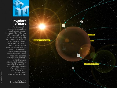
The magazine that got the most attention prior to iPad launch was Wired. They had partnered with Adobe and developed a Adobe Air based magazine format that could be exported and ran on the iPad. Apple’s developer rule changes in April that banned cross-compilers from being used to create app’s meant that a rethink on that approach had to be done. Wired still made the iPad launch and there’s no doubting it’s an impressive app but is it the future of publishing?
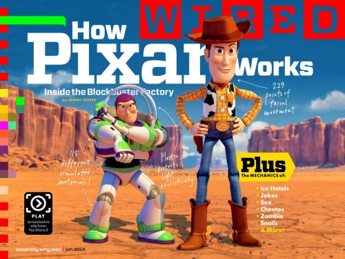
When the iPad app store opened this was my first download. It was also one of the longest – just one issue of Wired is over 500mb in size. Wow. That helped me make the jump from an iPad of 32GB to 64GB. I’ll cover more of why the app is so large later on. The app launches quickly and takes you straight to the cover page of Wired. One of the main advantages of the digital edition is the addition of audio, video, photo’s and other interactive elements. Take the cover – How Pixar Works which is an article on Toy Story 3. The bottom left of the cover has a little black button which once pressed launches a clip from Toy Story 3 – very nice. Not obvious at first but the story headings on the right hand side of the cover jump to the article in the magazine. The jump is quick and the page renders smoothly. Great – I want to jump back. Grrrrr – no back button. If Wired learn one thing, please add a back button as it really hampers navigation.
Click once in the centre of a page to display navigation options. A home button takes you to the cover page, a bullet list icon on the left of the toolbar shows a drop down list of all the contents. An icon on the right hand side of the toolbar shrinks the current page, displays all the pages and allows you to scroll quickly between all the pages. Finally theres a scroll bar at the bottom which allows you to move between pages. To actually navigate while reading, drag on the page either left to right or up and down. While this is fine for most pages, it does mean that you can miss content that is viewable by scrolling up and down. It’s not the most intuitive but by using the top right hand side icon you can see all the pages that have vertical content – there’s quite a few with the longest being 13 screens deep.
I actually like the added content like animations and video’s and this isn’t just limited to the Wired editorial – adverts also have video’s and extra photo’s as well. The adverts are the same as the print edition apart from the interactive elements so that a sale on the App store counts towards that months circulation. The bit I’m not convinced about is the actual navigation. It’s ok but they have to tell you what to do – click here for a photo, press these buttons to see alternative views. It reminds me of the interactive CD-Roms that were all the rage when cd’s were launched. Another negative is that you need to buy a new app for each issue of the magazine. I would have thought it would have been an app which allowed you to buy anew issue via an in app purchase, notified you when the new issue was launched allowing you to easily replace my real world subscription with a digital one. Alas it doesn’t seem to work that way. It’s going to lead to a lot of installs over time that even the folders of OS 4.0 won’t help much with.
Speaking of price, the Wired app was £2.99 to buy. This was the US version of Wired but assuming this is the price when the UK version launches, that’s £1 less than the UK cover price of £3.99. The price is also $1 less than the US cover price. However I subscribe so each UK issue costs £2 and you can get similar subscriber savings in the US so the app price is higher than I usually pay. There’s quite a discussion around whether digital distribution should lead to cheaper costs. I have no clue on the costs of producing a magazine so it’s a hard one to call – only time will tell if the costs will drop over time. Steve Jobs seems to think that the future is to drop the price and chase volume. Who’ll be bold enough to step up and try it? Will the market be forced into it?
Going back to the Wired app, some industrious folk have looked into the app bundle itself and figured out how it was built – the analysis is quite surprising. From The Hip blog breaks it down quite simply – most of the content of the 527MB app is PNG’s. Each page is a large PNG. Scrap that – each page is at least 2 PNG’s, a different PNG for horizontal and vertical layout. So that explains why you can’t cut and paste text from the Wired app. Interface Lab does a more in depth break down – 350MB of images with the rest being made up of video and sounds. More crazy – some of the animations are just a series of jpg files. The progress bar on audio clips – a series of png’s. Is this really the future? A final detailed analysis on the actual page layout and typography can be found on Information Architects – a great read.
Undoubtedly what we are seeing is the fallout from the Apple developer changes which meant Adobe had a small amount of time to deliver the Wired app. Since the Wired app came out Adobe has announced it’s Digital Viewer Technology for Magazines, which will be an add-on for InDesign CS5. A good play from Adobe as there’s not really another solution on the market apart from developing your own app or relying on distribution via PDF’s.
 Wired isn’t the only digital magazine though. Another publication with a funky interface is Popular Science. This is great to look at but not so great to navigate. In fact, they had to add a section on how to use the app – that should have set alarm bells ringing. I prefer Wired to Popular Science.
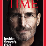
The magazine I’ve enjoyed the best is Time. It’s app allows you to browse through a range of issues and buy from within the app. Each magazine costs £2.99 and is downloaded and stored within the app. Navigation is similar to Wired but more obvious although they also felt the need to include a guide – I’ve never needed a guide to read a magazine before. Time for me is the winner so far with regards magazines on the iPad but at the same time highlights some features missing from the platform as a whole.
For the iPad to really step in and offer a complete solution it needs to offer a few key features. Firstly you should be able to subscribe to newspapers and magazines. Secondly, the content should be delivered to the iPad rather than the user having to download each time they want a new issue. The biggest omission though is the lack of a unified store front. iTunes for music and app’s, iBooks for books but nothing for magazines or newspapers. Maybe that’s Apple’s cunning plan – let each publisher flounder around on their own then offer a service at a later date which they will all flock to. They’ve got the hardware and infrastructure so maybe it’s just a matter of time. It will be interesting to revisit this in six months time once the user base is more established and publishers have got their heads around content generation, delivery and costs. Are app’s and PDF’s really the way forward? Surely HTML5 formats that can be consumed on any platform make most sense for publishers? Exciting times.

